Victorious
Content Management System
Once we successfully created a framework for the app, we needed to think through an internal system that would allow us to scale by launching multiple apps more efficiently. We had a tool that was being used but needed to re-think it to support the new product experience.
My role was to lead the design for the re-design of our internal editing tool that powered the apps. This included working on product strategy, research, information architecture, visual design, and the delivery and implementation of the final product.
Research and User Testing
Product Design Strategy
UX and Visual Design
Task analysis
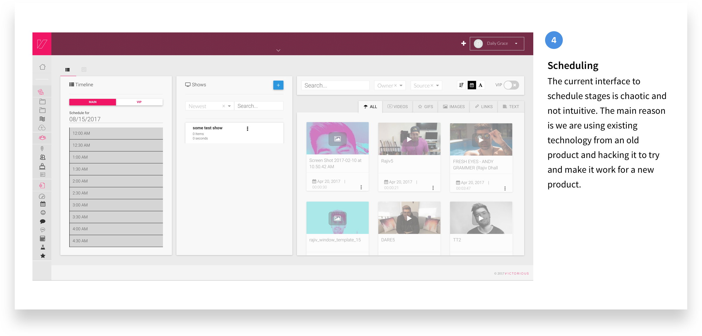
Our first objective was to do a thorough task analysis of the current CMS to identify immediate pain points that our partner managers, marketing team and editors had while using this platform. There were 4 key challenges with the existing experience:
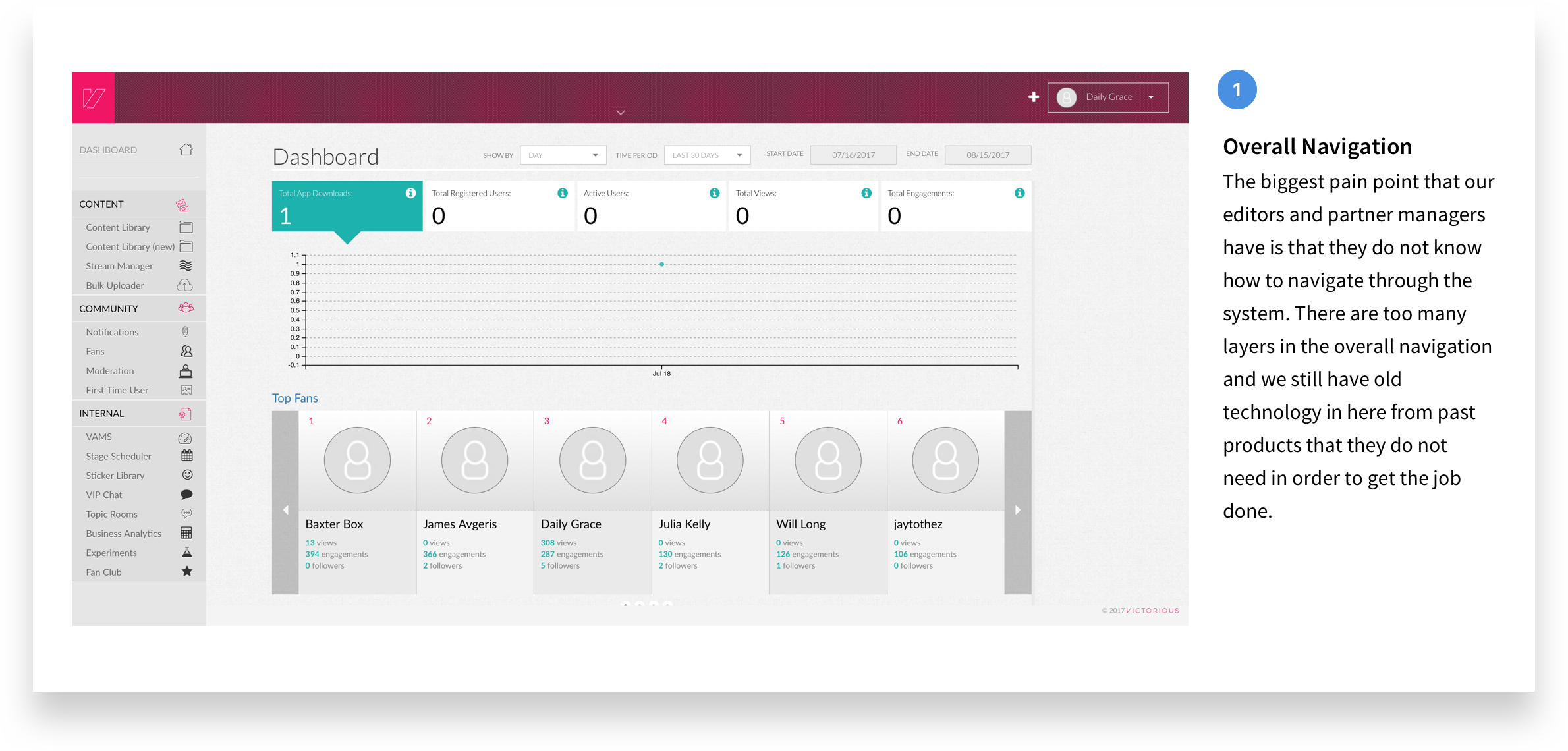
1. Overall navigation was too cluttered and confusing.
2. The current design did not match their workflow and users had a lot of workaround and 'hacks' to get their job done.
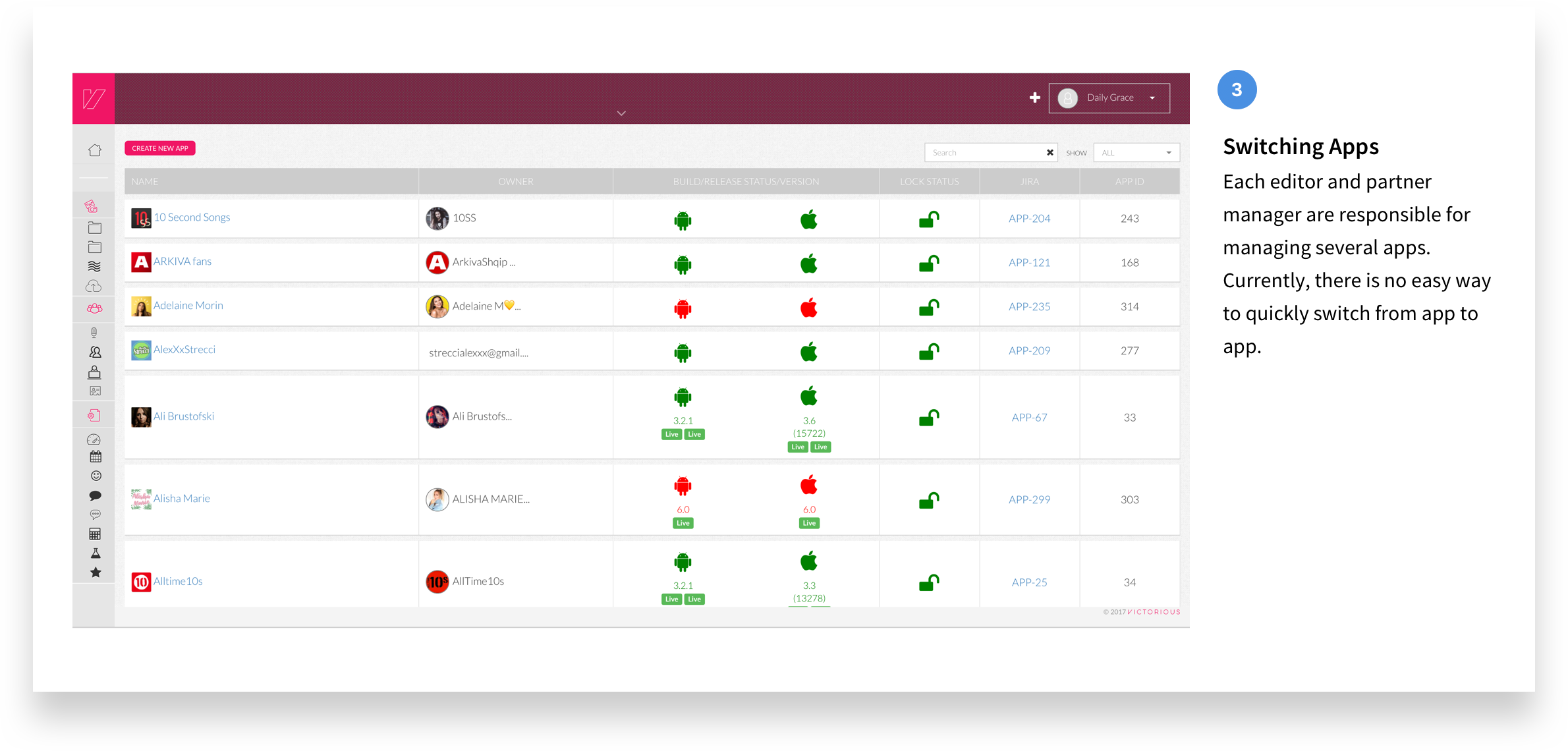
3. Content managers managed multiple apps at once and switching between those apps was a challenge.
4.Scheduling events was a big challenge and took a lot of time to set up.
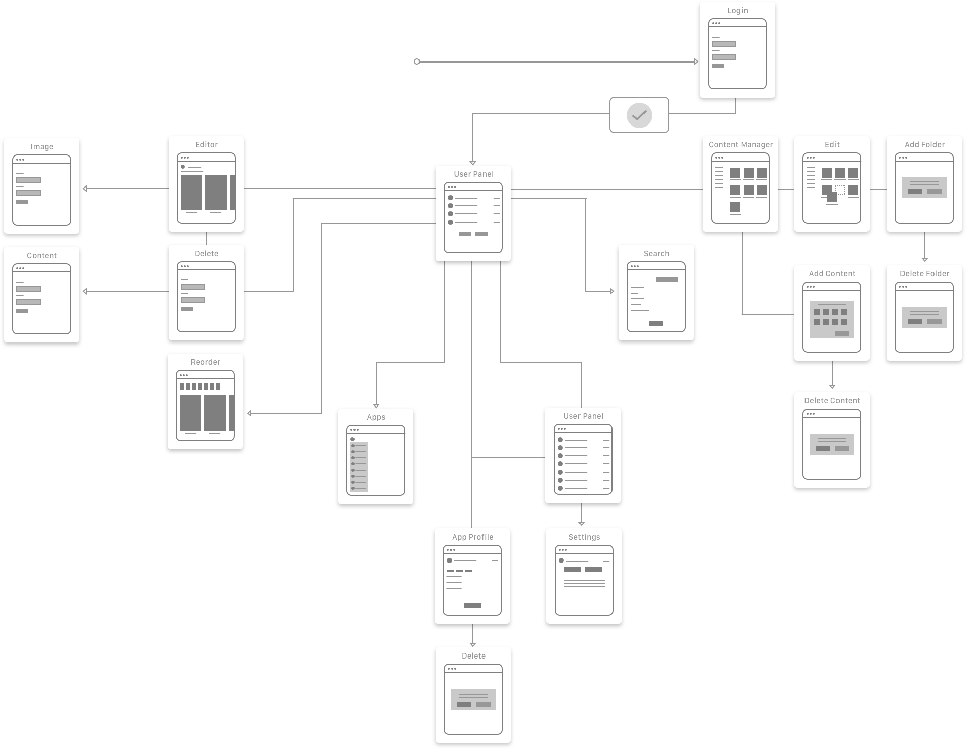
Site map
The biggest challenge for the project was to ensure that we eliminate all the unnecessary clutter of the existing experience. We created a site map to help narrow down the foundational structure of the new experience.
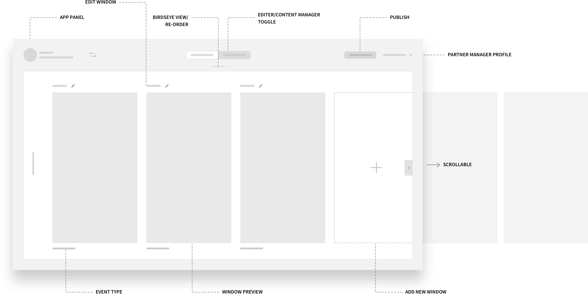
New navigation
The biggest pain point that our editors and partner managers had was they did not know how to navigate through the system. There were too many layers in the top and secondary level navigation and there was old technology in there from past products that they did not need. We re-designed the navigation to remove clutter and focus the experience on only the tools and features they needed.
Updated styling
We also created a new style guide that was clen and less distracting.
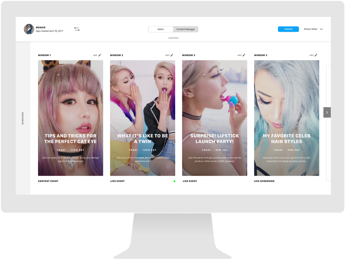
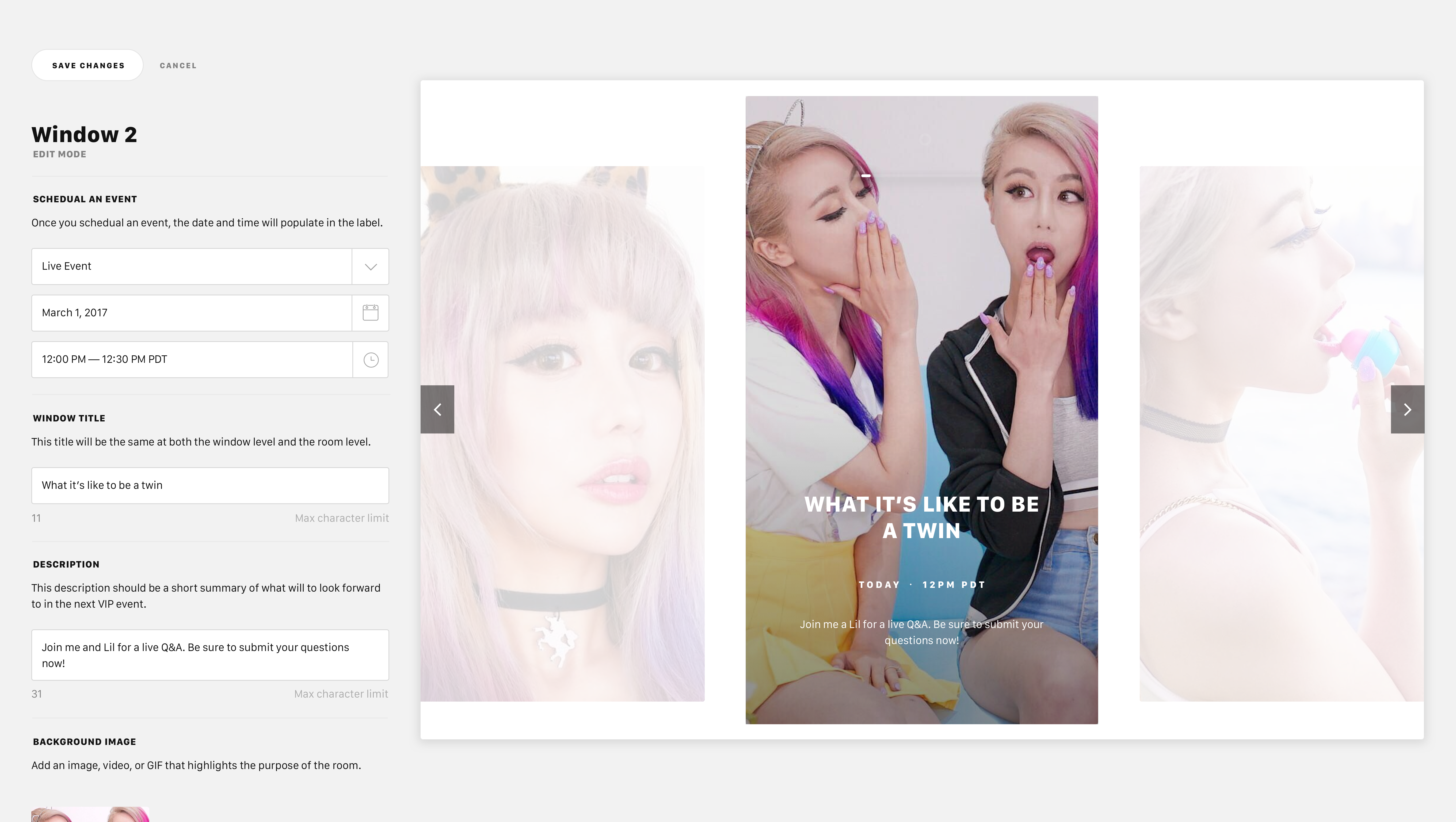
Wysiwyg approach
With the current experience, it was not easy for editors and partner managers to see what the content would actually look like when published. Editors would upload content and hope it looks right in the app. There needed to be an easy way for editors to quickly edit content while seeing how and where it will appear once live.
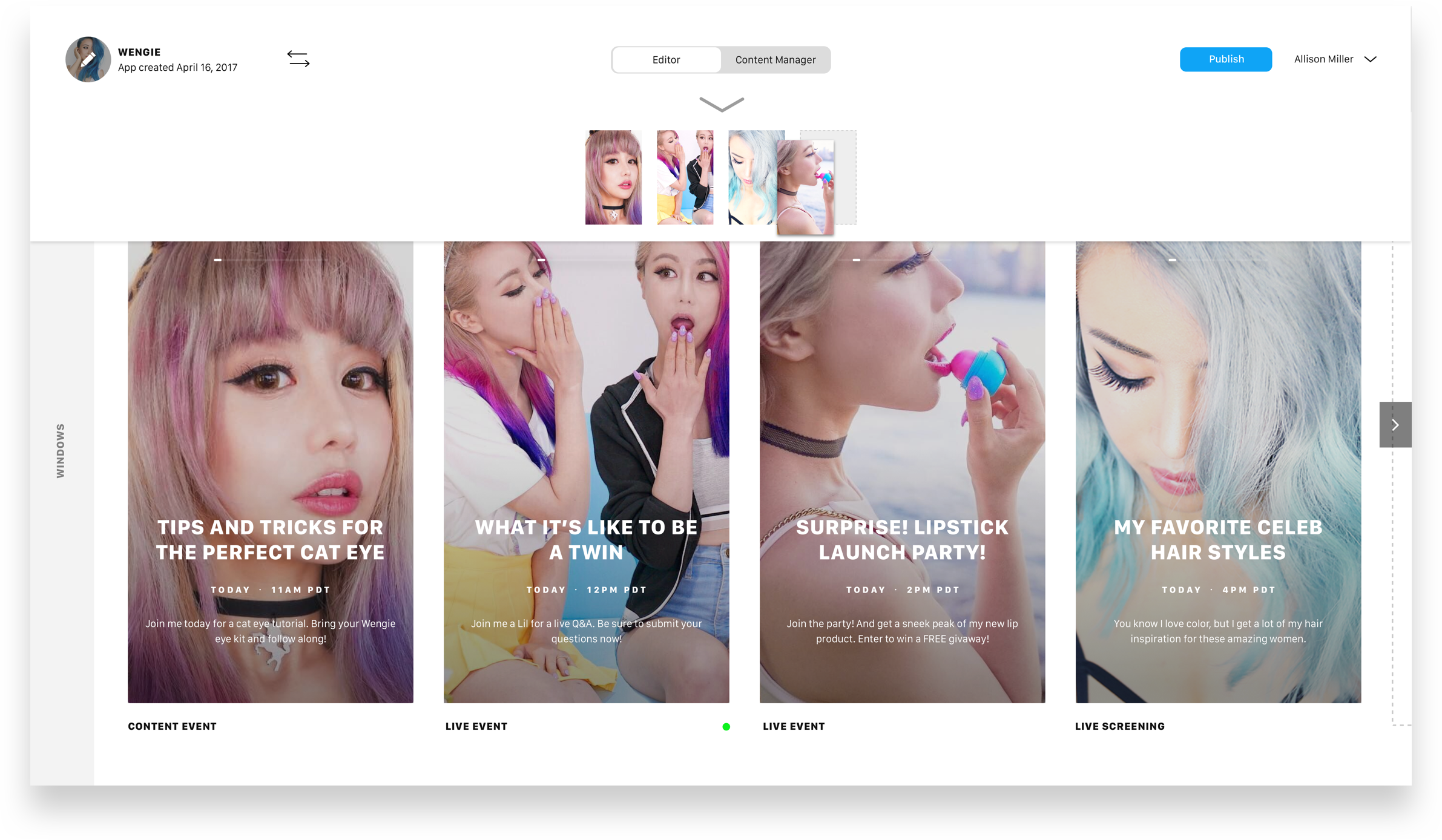
Birds eye view
Content in the app is constantly updating daily. We created a simple tool to help our editors see the full layout in real time. This allowed for easy and quick editing.
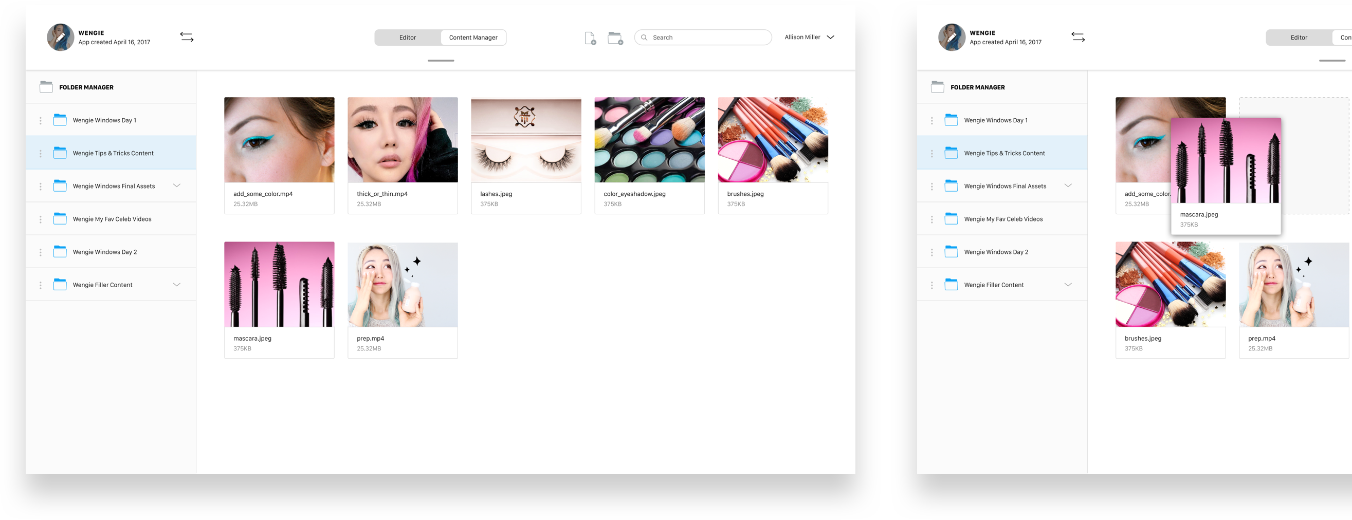
New content manager
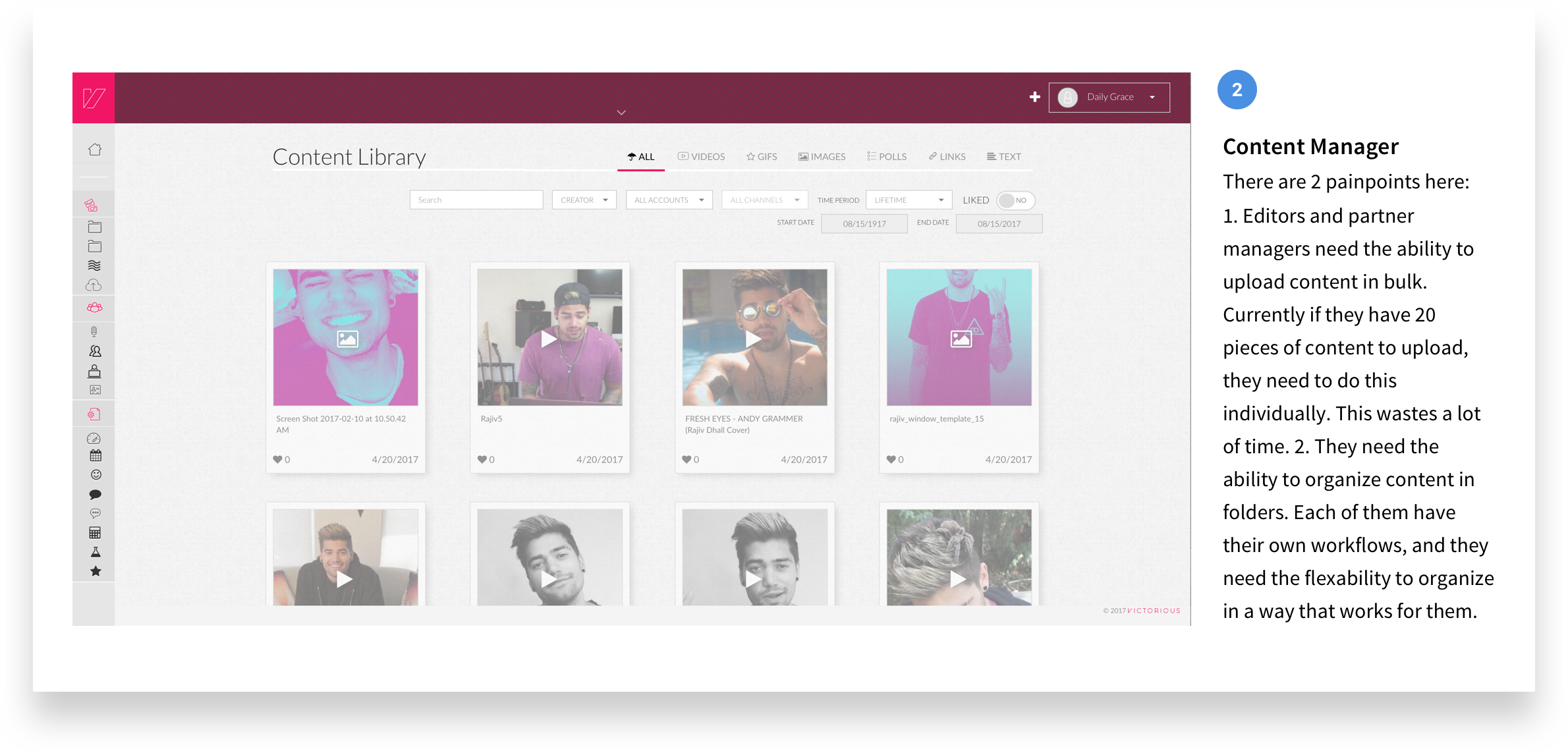
While interviewing our editors, we got a lot of feedback on their biggest pain point - the content manager. We redesigned it to be easy to upload files in bulk and edit and organize them to complement their individual workflows.
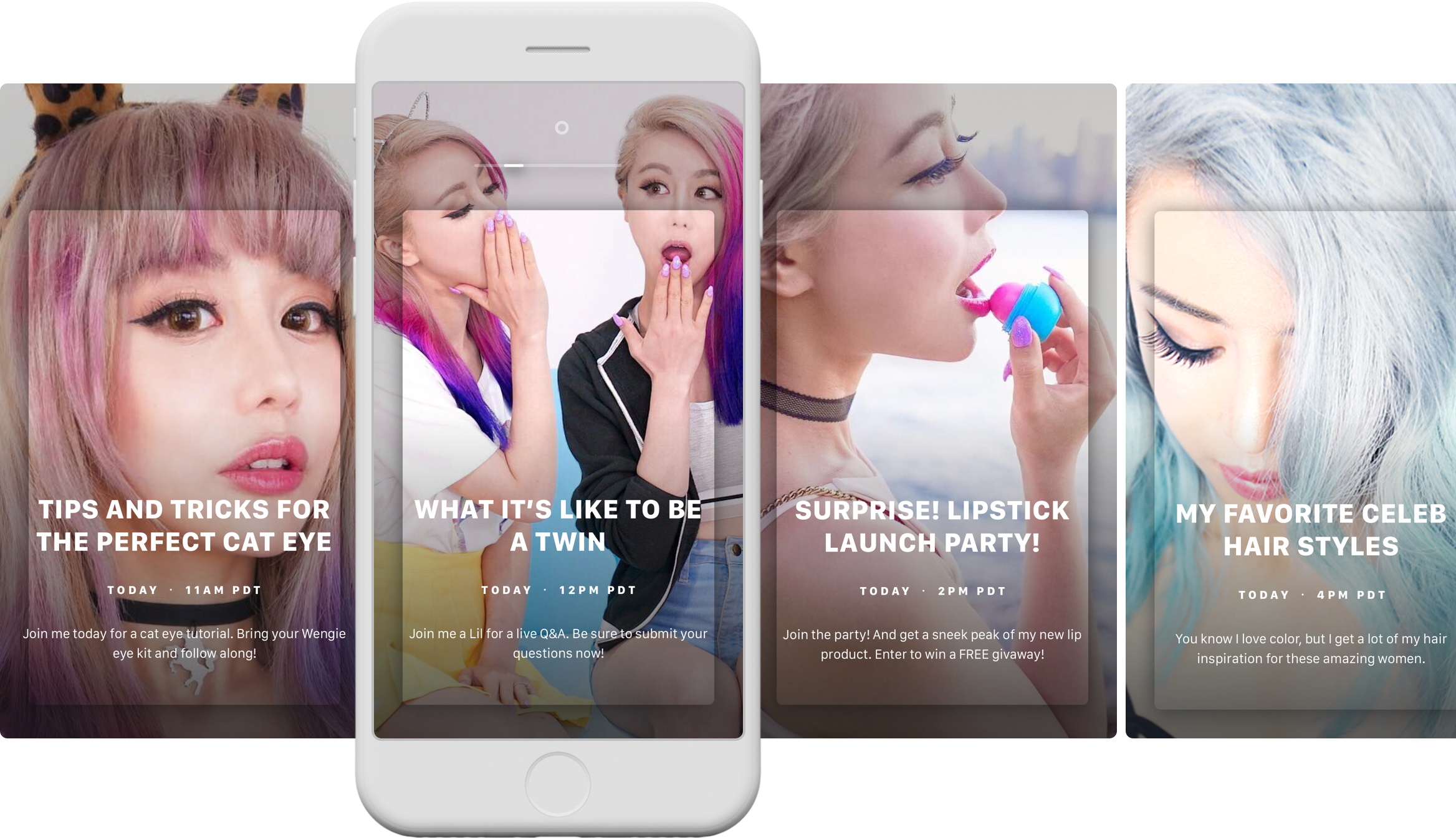
The results?
Editors and partner managers can focus on creating, we make it look good by default.
Samantha Gilbert
Los Angeles, CA
Email:
